
How to Design Door Signs That Reflect Your Brand Identity
Door signs are more than just directional tools—they’re a vital part of your brand experience. Whether it’s an acrylic nameplate on an office door or a directional sign in a hotel, every sign should align with your brand’s visual identity and voice.
In this guide, we’ll walk you through how to design door signs that effectively communicate who you are as a brand—consistently, clearly, and professionally.
🔹 1. Start With Your Brand Guidelines
Your brand’s identity includes a combination of:
-
Logo
-
Color palette
-
Typography
-
Tone of voice
-
Design elements (icons, borders, layout preferences)
Before you begin designing any door signage, ensure these brand elements are clearly defined and accessible.
🔹 2. Choose Colors That Communicate Your Brand Personality
Color has a psychological impact and communicates tone immediately:
-
Blue suggests trust and professionalism (great for law firms, banks)
-
Green implies health and calm (ideal for wellness or healthcare)
-
Black or gray conveys luxury and sophistication
-
Bright tones express creativity and energy (good for tech or design studios)
Ensure contrast between text and background for readability, especially for outdoor or low-light settings.
🔹 3. Select Brand-Aligned Fonts
Typography is a powerful brand signal. For door signs:
-
Use the same fonts as in your marketing materials or website
-
Keep it simple and legible, especially from a distance
-
Stick to one or two font styles to maintain clarity and consistency
Avoid decorative fonts for critical information like room names or numbers.
🔹 4. Pick the Right Materials and Finishes
Different materials reflect different brand impressions:
-
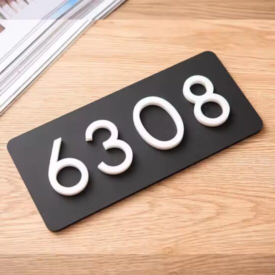
Acrylic: Modern, clean, and customizable—ideal for startups and professional firms
-
Metal: Premium, sturdy, and formal—great for law offices or executive spaces
-
Wood: Natural and warm—perfect for boutique, eco-friendly, or creative brands
Consider finishes like matte, glossy, frosted, or mirrored to further match your brand style.
🔹 5. Incorporate Your Logo Strategically
A logo reinforces brand recognition. For door signs:
-
Place it in a consistent position across all signage (top-left, centered, etc.)
-
Make sure it doesn’t overpower essential information
-
Use full-color logos indoors; opt for single-color or etched logos for a subtle look in upscale environments
🔹 6. Align Layout With Brand Consistency
Structure your sign design to feel like a natural extension of your brand. Keep:
-
Margins, alignment, and spacing consistent
-
Text hierarchy clear (e.g., Room Number > Name > Title)
-
Icons and arrows in line with your visual style if using wayfinding elements
Pro tip: Create a signage template library for all departments to ensure cohesion across locations.
🔹 7. Match Tone and Function
Your door signs should speak with the same voice as your brand:
-
A luxury hotel might use elegant serif fonts and minimal icons
-
A creative agency could include quirky icons, bold colors, or layered shapes
-
A medical office may opt for minimal, calm, and clear labels
✅ Final Thoughts
Branded door signage isn’t just about putting a name on a wall—it’s about creating a cohesive visual language throughout your space. With the right combination of colors, fonts, materials, and layout, your door signs will communicate your brand story from the moment someone walks through the door.


